Lagom (Redesign)
Objective
Select an existing mobile application with a business problem and redesign that application to solve the current problems in the application. Ensure that the design screens follows a task flow.
Tools
Figma Photoshop
Skills
Marketing Advertising Prototyping Layout
Role
Web Design UX Research UI/UX Web Developer
Duration
Five Weeks
Overview
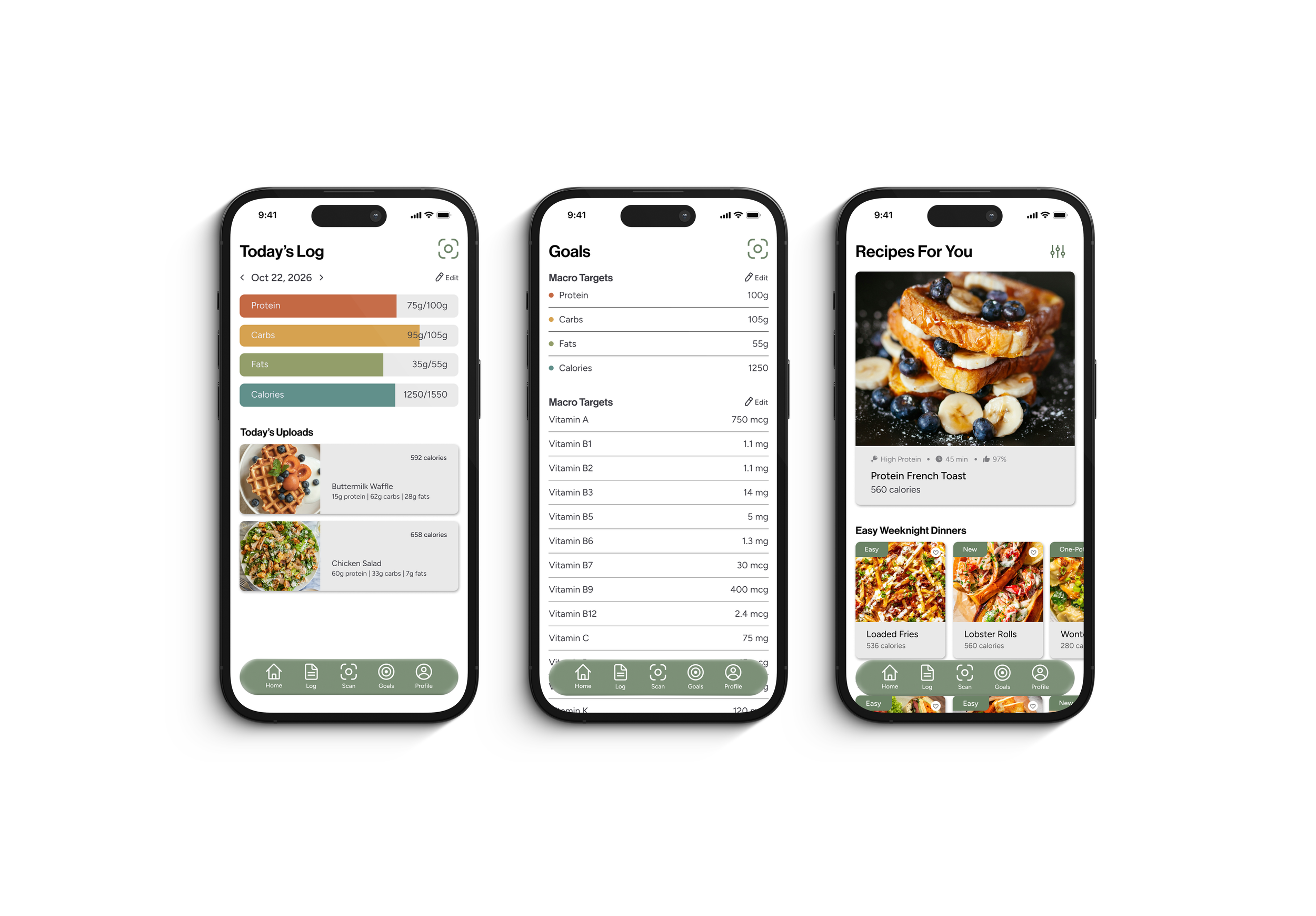
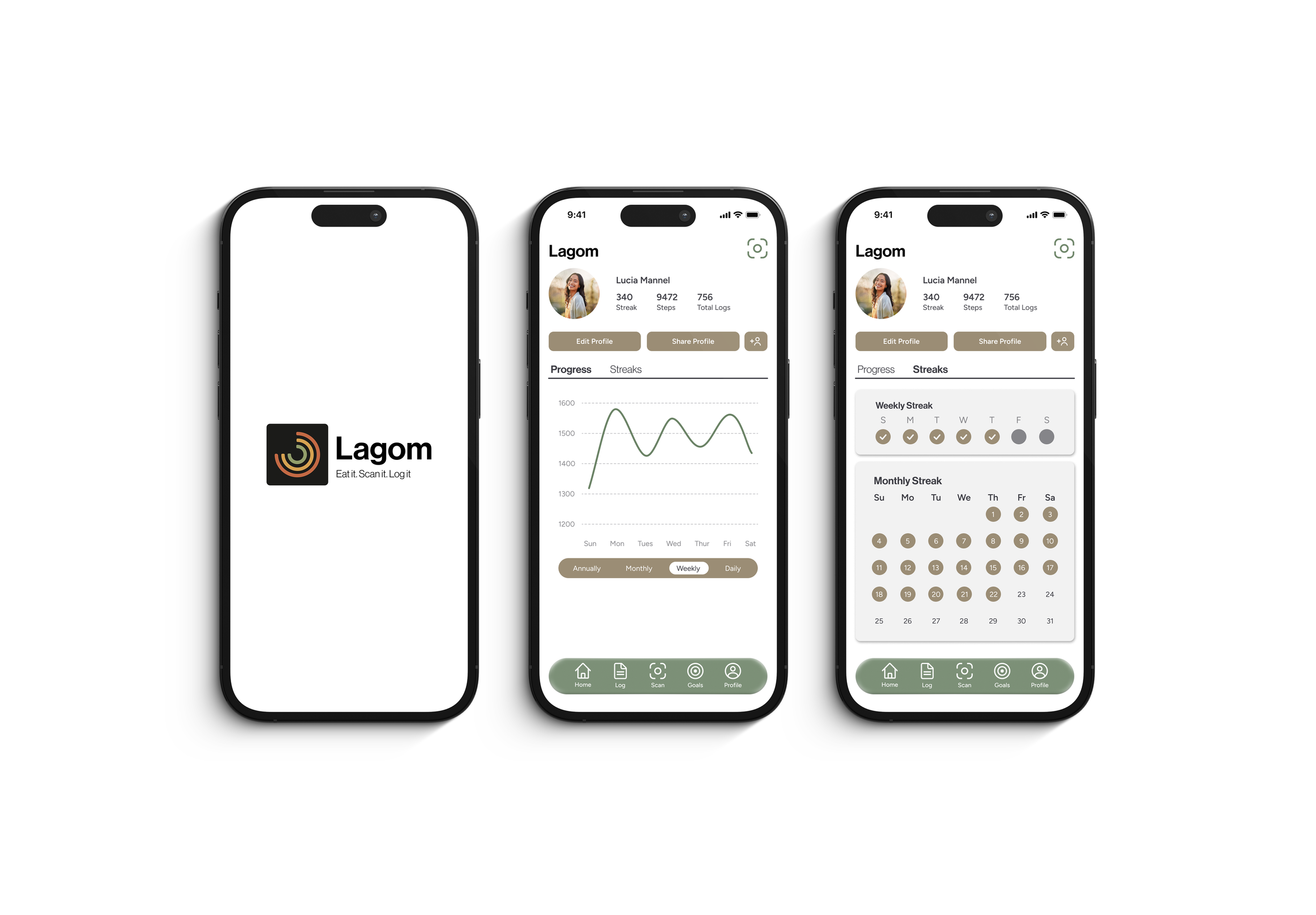
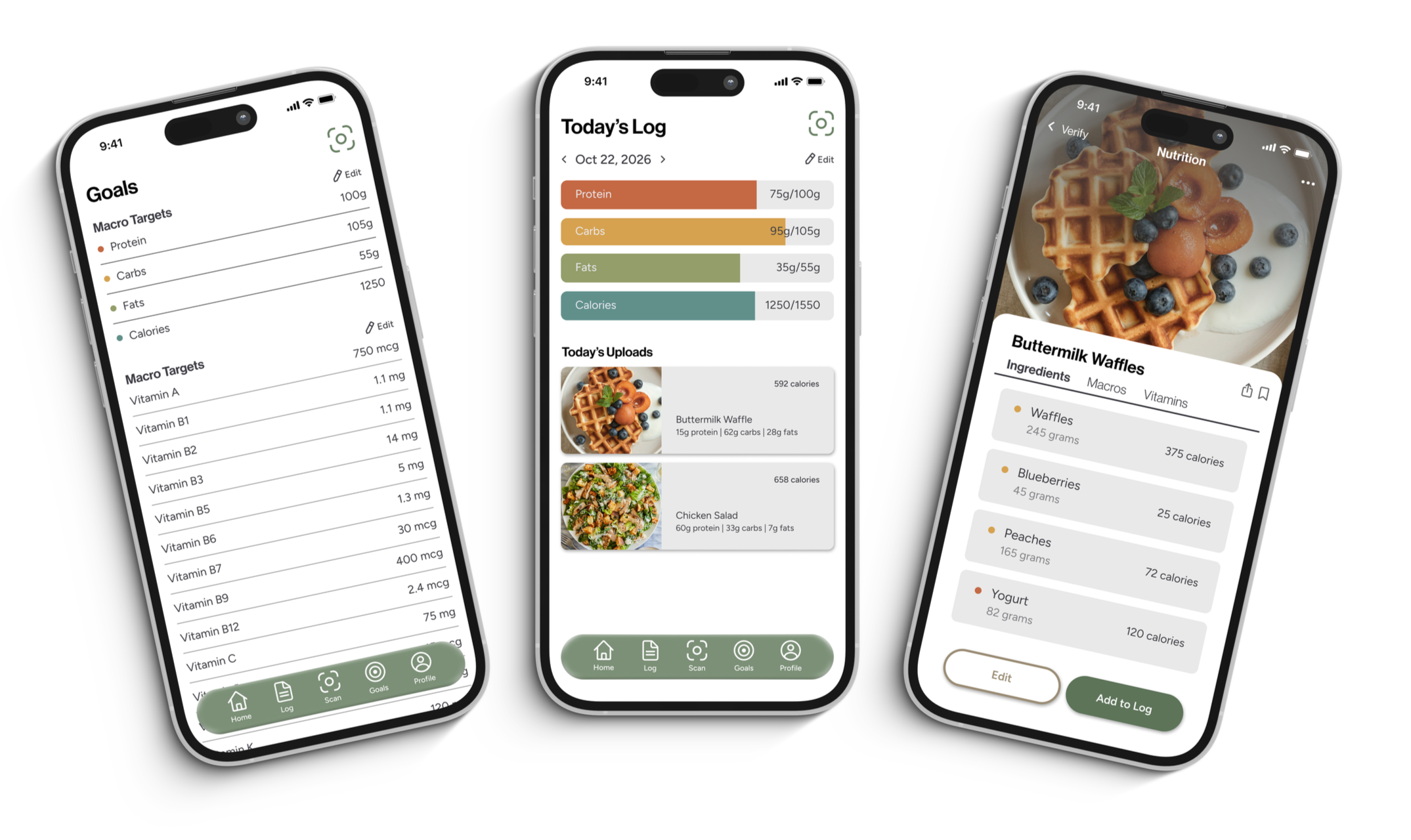
Lagom is a macro tracking app and its main features offer various ways for users to log food and meals including scanning nutrition labels, food plates, or ingredient lists. Visual charts throughout the applications helps users track their daily intake, and detailed macro breakdowns allow users to see clear insights on what they have consumed.
Business Problem
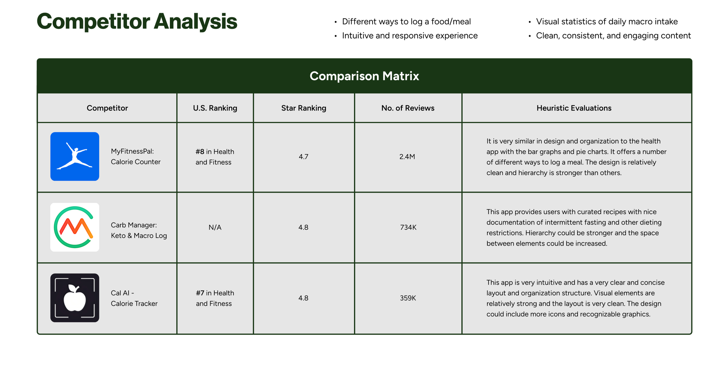
With many macro tracking apps on the market, finding a standout application that outcompetes all the other options out there can be difficult. However, the current structure and design of Lagom lacks
an exciting, intuitive, and engaging user interface which is what prompted the redesign.
Audience
The target audience for Lagom ranges from young teens to middle aged and older adults who are looking for an effective way to track daily nutrition intake and manage vitamin deficiencies without having to deal with overly complex steps. These individuals are conscious of their nutrition choices and are looking for an engaging, intuitive, and easy-to-use app for macro and vitamin tracking. By streamlining logging workflows and visualizing nutritional gaps, the interface empowers users to make informed dietary decisions while keeping daily interactions seamless, accessible, and motivating.
Young teens and young adults prioritize fast, low-friction interactions and visual clarity. They are driven by social trends, fitness goals, or initial steps into dietary independence, they favor quick visual logging, barcode scanning, and progress tracking. Complex manual entry or overwhelming data density quickly turn them away, making intuitive interfaces and feedback critical for engagement.
Audience:
Middle-aged adults often balance busy personal and professional schedules, using nutrition tracking to optimize daily energy, manage weight, or proactively address long-term health. They require efficient meal logging workflows and structured reports that track macros without demanding excessive time. Straightforward customization and actionable health insights serve as primary drivers for these users.
Older adults typically focus on managing specific health conditions, monitoring micronutrient and vitamin deficiencies, or following dietary guidance from medical professionals. For this group, readability, high contrast typography, clear visual hierarchy, and easy navigation are essential. Clear trend visualization over time helps build trust, reassuring users that their daily choices support long-term wellness.
Pain Points
Content Issues
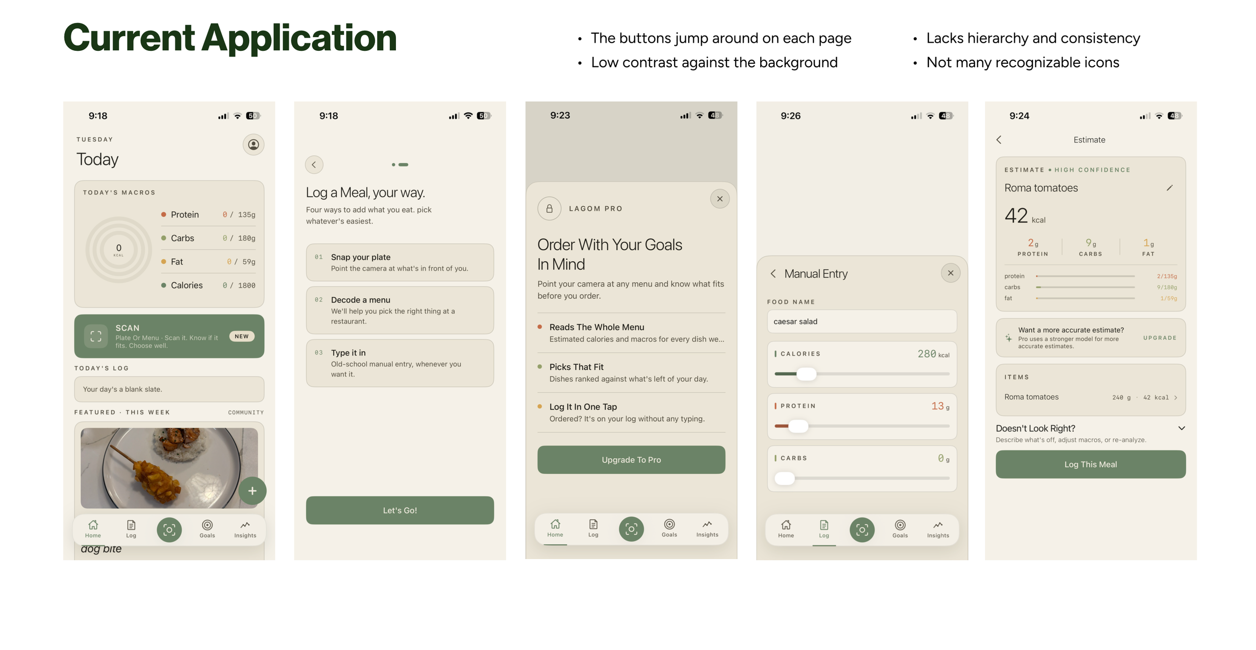
In Lagom’s “Log a Meal, your way” section, the directions specify four ways to add what users eat. However, only three options are listed below. Misleading content is one of the fastest ways to drive away new users. When tracking calories and macros, consistent content is essential. Additionally, inconsistent capitalization and abbreviations throughout the app make it hard for users to follow along. The abbreviation “kcal” is used significantly less than the word “calories,” which can confuse users tracking their intake. Furthermore, on the Home page, the word “today” is repeated multiple times, which is highly redundant. Using it once is enough to indicate that the statistics refer to the current day. Lastly, the presence of grammatical errors makes the app appear untrustworthy and unreliable.
Usability Issues
The "Nutrition Label" scan frequently crashes or fails to successfully log many products, essentially making the feature ineffective and forcing users to spend extra time selecting alternative options. Similarly, the "Plate" scan frequently misidentifies food items, leading to inaccurate summaries of daily intake and requiring manual corrections. While manual logging is available, it requires filling out a number of fields without a visual scroll bar to indicate that there are additional inputs below. Finally, tapping the "Today's Macro" card toggles the display between the consumed macros and the remaining macros. However, this feature is not advertised, leaving users unaware of its availability.
Technical Issues
Lagom features several buttons with delayed responsiveness, they often require multiple taps to register an action. Additionally, double-tapping the “Insights” section redirects the user to the Home page, whereas double tapping other options does not. Double tapping any menu option should instead take the user to the top of that page, this is an action that is not present throughout the app.
Visual Issues
The various pages within the Lagom app feature a wide range of font sizes, making the visual hierarchy difficult to determine. Additionally, the colors used for the frames and fonts lack contrast against the background, which defeats the entire purpose of having them. These frames also lack depth due to the absence of drop shadows, creating an interface that feels flat and uninviting. Furthermore, the charts on the Home page do not feature a gray background fill, making it challenging to assess progress in relation to the overall daily targets.
Organization Issues
Lagom tracks macronutrients like protein, carbs, and calories, which are consistently listed in the same order, except on the Goals tab, where they are reordered. The text grouping is highly inconsistent, which leads to an unintuitive user experience. Some pages read from top to bottom, while others open with a slide up menu that reads from the middle of the screen downward.
Task Flow
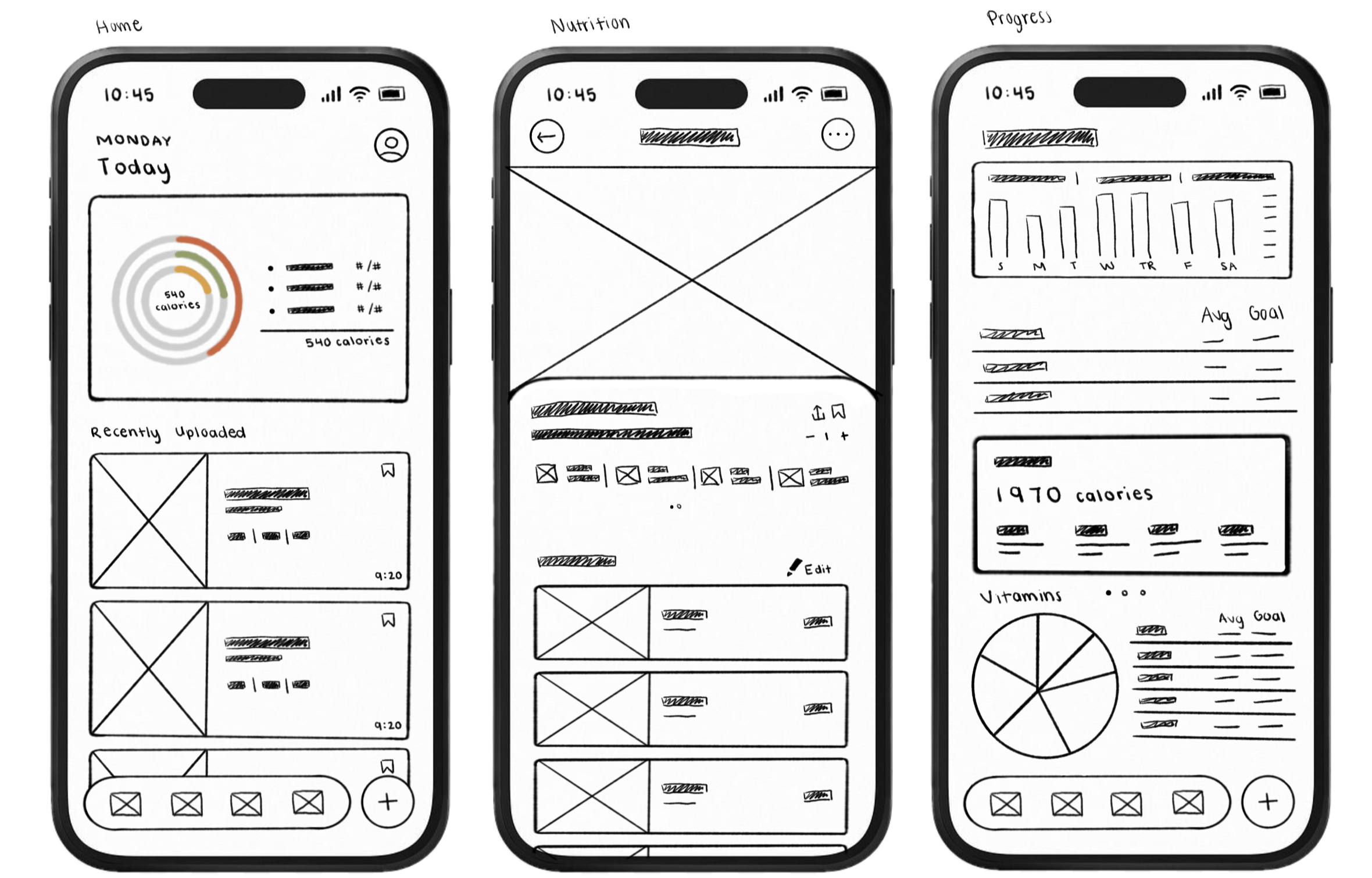
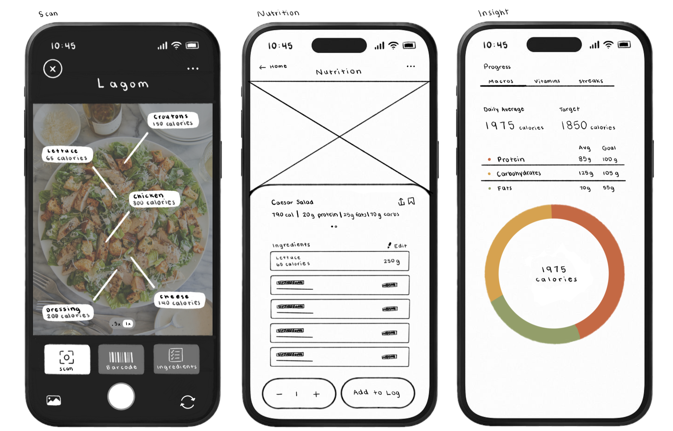
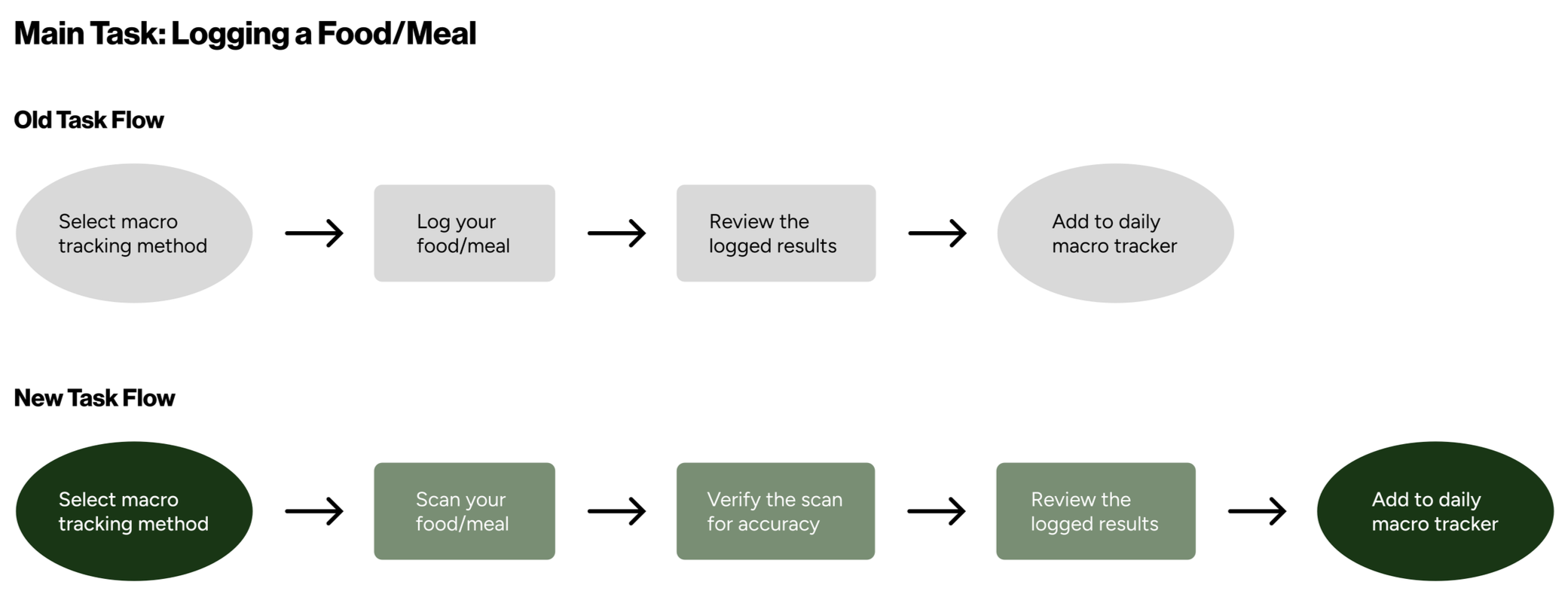
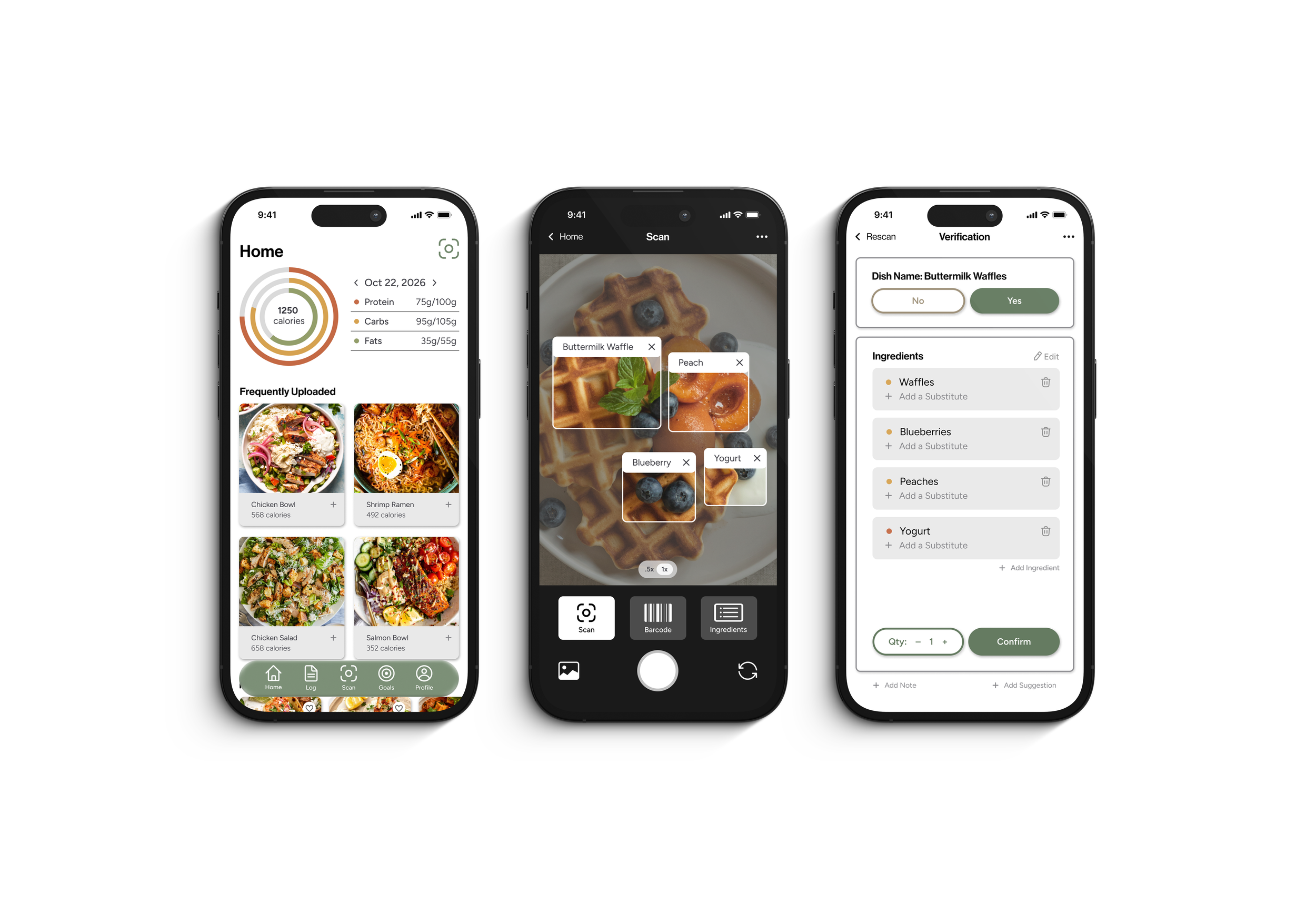
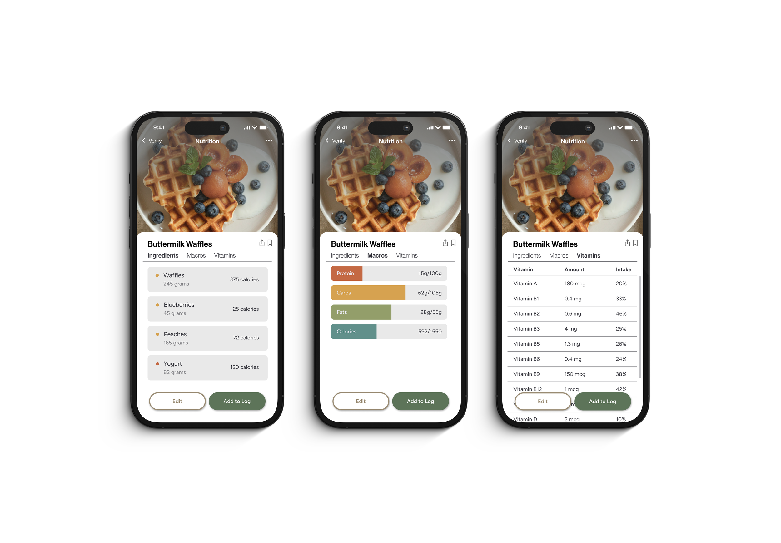
The main task flow centers on logging a food or meal, an interaction designed to ensure fast, accurate nutritional tracking. The original flow required users to select a tracking method, manually log their meal, review the results, and add them to their daily tracker. In order to enhance accuracy and decrease friction, the redesigned task flow introduces camera based scan after method selection. Users then verify the automated scan for accuracy before reviewing the final results and updating their daily macro targets, significantly reducing manual input while maintaining precision.
Concept & Strategy
The main objective of the Lagom redesign is to make the interface more intuitive, engaging, and inviting for all users. By integrating barcode scanning and allowing for quick visual logging, the platform significantly reduces the time required for data entry. The core dashboard uses high contrast data visualization and color coding to provide immediate feedback on daily macronutrient targets and micronutrient balances without an overwhelming amount of content.
Concept & Strategy
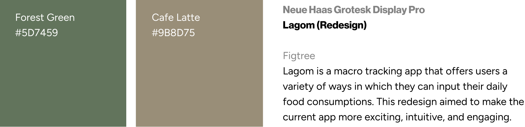
To support accessibility across diverse user demographics, the user interface relies on clean typography, generous touch targets, and high contrast screens. Clear hierarchy and structured visual reports allow users to quickly digest complex nutritional trends over weekly or monthly times. Progress indicators and tailored health notifications further drive long term user engagement, creating a balanced and motivating environment that adapts to varying levels of digital literacy.